
Role:
user interviewer
ux designer
workshop facilitator
account lead
Outcomes:
launched v1 of a
——
———
————
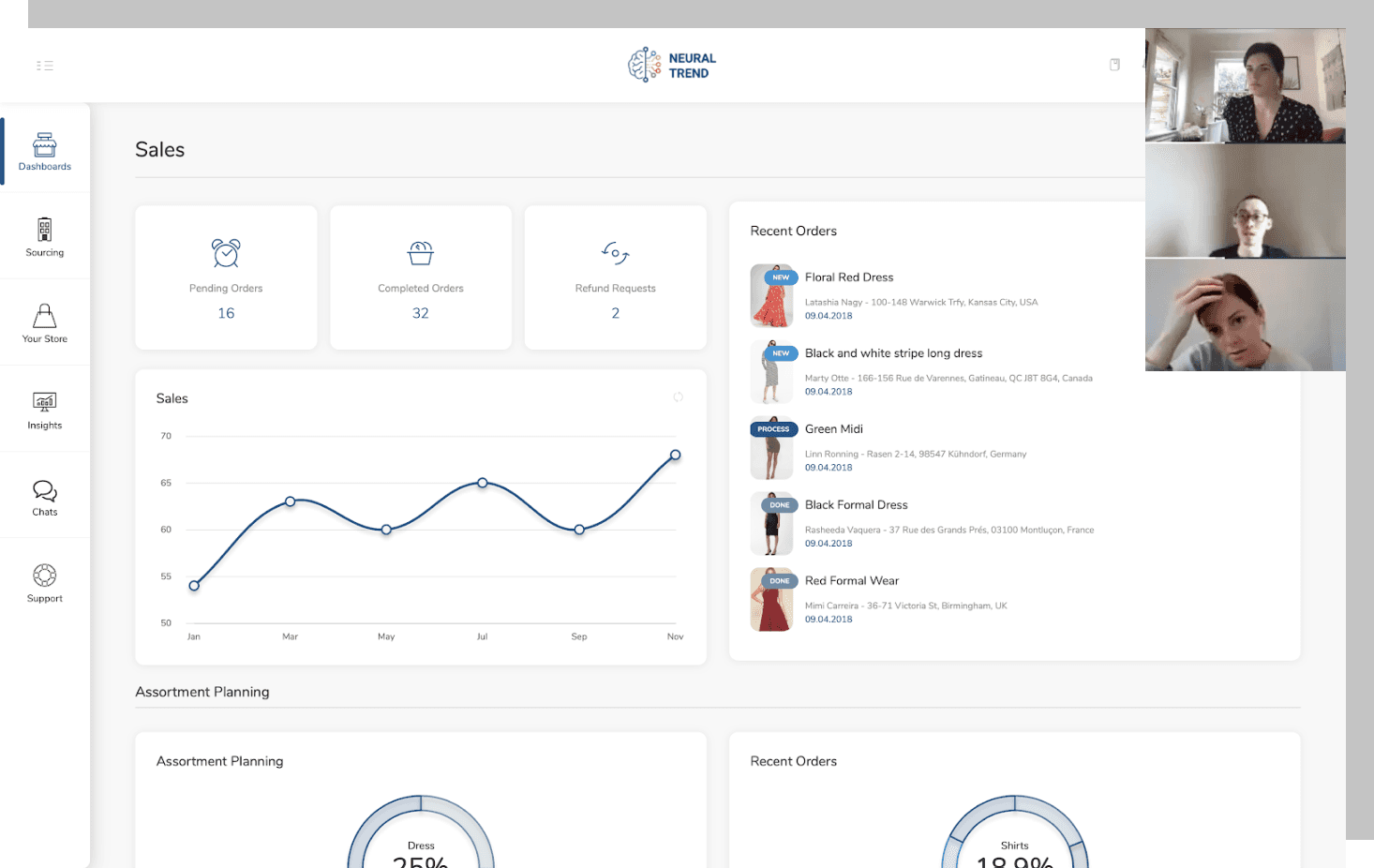
I helped build an analytics platform for retail buyers in fashion.
It was an exercise in mapping the fashion retail buyer's workflow and decision-making process.
Neural Trend AI was building a predictive analytics platform, using large-scale data mining to help fashion retailers discover and assess trends, project sell-through of products, and make smarter buying decisions.
A startup quickly gaining traction, Neural Trend was receiving feedback from pilot clients that while the insights provided were highly useful, they wanted a better way to interface with the data.
At the time, Neural Trend was running proto-version of their platform - a non-interactive, ad-hoc report delivered monthly in PDF format.
And while the product team had put together a dummy dashboard to demonstrate primary features of the platform, it was built with zero input from fashion retail buyers - i.e., their core users.

This shaped our entire discovery process, and we found that insights from each would aid discovery sessions with the other.
A unique challenge to this project was that Neural Trend was still in a stage of refining its MVP.
So we took a dual-pronged research approach - staying in close conversation with stakeholders about the product's evolution, and with users about their needs.
Conducting participatory design sessions elicited strong opinions from our users.
Knowing that most of the information we were tasked with organizing could be found on the current dummy dashboard, we made the most of our user interviews by conducting participatory design sessions over Zoom to uncover when and why they would want to use each feature, as well as how they would want to see them organized.
6 buyers and planners participated in these design sessions over 4 weeks.

"How do you need this information organized?" "What makes the most sense to you?" "Why does that make sense to you?"
Digging a little deeper using Root Cause Analysis, we employed a '5 whys' technique to make sure we were identifying and solving for the right problem.
3 distinct user needs emerged from those conversations.

Digging a little deeper using Root Cause Analysis, we employed a '5 whys' technique to make sure we were identifying and solving for the right problem.
"Some of the tools we currently use for insights is really time consuming. I think it would be so much more intuitive if it was organized in the way we like to work."
- User 1, Buyer @C&A
"For me, 'intuitive' is something that knows how I want to see the information. From a planning perspective, the biggest thing is making it easier to manipulate data."
- User 2, Omni-merchandiser @Ann Taylor
Unsurprisingly, what buyers and planners cared most about in their workflow was the ability to save time and reduce unnecessary work.
Information prioritization
Information manipulation
Information simplification
We found that to fashion buyers, "intuitive" meant finding workflow efficiency through the way information is organized.
These 3 themes would serve as the guiding principle for how the dashboard would be developed.
We interviewed the Neural Trend team for a deeper understanding of the product and a broad perspective.
We held 5 individual interview sessions with the CEO, CTO, product strategist, product manager, and sales director of Neural Trend to better understand how all of the capabilities and features of the platform should come together as a tool for retail planners and buyers.
It was clear that while the ultimate platform vision was to provide use cases for a variety of audiences for various applications, the immediate and primary use case was to aid the buying process for next season, specifically for buyers.
The big takeaway
The product's core value proposition is to aid fashion buyers with the process of buying for next season.
Order of the buying process
Evaluations made
in the buying process
Decisions made
in the buying process
This gave us a clear outline for 3 areas to explore in our next round of discovery.
A deep-dive into the buying process
3 buyers and 4 stakeholders participated in individual 30-45 minute workshop sessions

Equipped with insights from sprint 1, the team set out to understand exactly what the buying process for next season looked like - this would inform how we'd prioritize information on the dashboard.
To do this, we conducted a journey map workshop where we had users and product stakeholders arrange a list of tasks that reflect the decision-making process of buying for next season, all selected from a group of possible actions on the Neural Trend platform.
Buying process - insights
While every buyer approached the process slightly differently, the patterns that emerged allowed us to create a composite process-flow as seen below.

3 buyers and 4 stakeholders participated in individual 30-45 minute workshop sessions
The buyer's journey provides a clear framework for how we can prioritize information intuitively for the buyer.
We'd use this to make design decisions for the dashboard and the features to be built.
1.
Sales review
2.
Insights review
3.
Product review
4.
Benchmark review
5.
Negotiation & purchase
6.
Performance monitoring
How did buyers evaluate the information they were looking at?
We identified two key patterns around the theme of information evaluation.
The buyer's approach to information evaluation

Research notes here have been re-annotated for brevity
"When I start forecasting, I want the most high-level, and then I drill-down and then go back up. In planning, we call that top-down, bottom-up."
- User 6, Buyer @West Elm
"First, dashboard view should be at the highest-level - then with the ability to drill-down to the most granular level."
- User 4, Buyer @Nordstrom
These two evaluative methods informed the manipulation controls to provide the buyer on the platform.
Top-down evaluation ("drill-down" approach)
Comparative evaluation ("benchmark" approach)
Divergent explorations

A revenue-centric approach

This exploration prioritized success metrics like sales goals and monitoring of in-inventory best-sellers, insights that are unique to the business using the platform.
A planning-centric approach

This exploration prioritized inventory trends and data to inform pricing/markdown strategy, geared for decision-making from real-time insights and optimizing for efficiency.
A buying-centric approach

This exploration prioritized most frequently-evaluated categories of trends to inform buying decisions for next season, and quick-filter options to manipulate data at-a-glance.
User ratings gave us a clear direction on how to move forward with design decisions.
User ratings

For each concept, users were asked to rate how beneficial they found the way information was organized, in each of these three sections:
'main dashboard' section
'insights' section
'lookbook' section
Concept 3 earned the highest ratings in each section and overall, which was also supported by the product team at Neural Trend.
We moved forward with final wireframes and prototypes based on this concept 3.
We preference tested data visualization options with our users.
In addition to concept testing, we used the opportunity to preference test variations on data visualization in order to understand how they need information simplified.
Test 1: assortment

Horizontal stacked chart
VS.

Donut chart
While the first option (stacked bar chart) of displaying assortment allows for a complete overview at-a-glance, we found that 80% of users preferred the second option (donut chart) - even though it required additional input from their end.
The takeaway here was that given the number of data points, cognitive load plays a factor in how 'simple' information is interpreted to be - i.e., not everything needs to be displayed all at once.
"Charts are important but with a lot of numbers, it can get overwhelming and confusing."
- User 1 (Buyer, C&A)
Test 2: color trends

Ordered (ranked) list
VS.

Vertical column chart
Winner: 'vertical column chart' (user preference 100%)
One key insight taken from preference testing: `Information simplification is achieved through a reduction in cognitive load, not a reduction in interaction load
One key insight taken from preference testing:
information simplififcation is achieved by reducing cognitive load, not by reducing interaction load
Visualization decisions
Given the number of variations and associated data points that would need to be displayed for trends across color, patterns, and product categories, I made the following design decisions:
Maximize the use of horizontal real-estate
Variation occurrence in each category is numerous (e.g., blue has 18 var.) and there is a need for all to be displayed at once
User engagement with the platform will primarily be desktop
Display trend values in descending order
Users reported more instances of seeking positive trend values over negative (left-to-right reading of data)
It provides an easy and consistent mental model for users to interpret both positive and negative-value data points
It removes the need for additional signifiers like 'green for positive and red for negative' (see option 1) which can create unnecessary visual noise when presenting data around color itself
Middle-align the x-axis
Trend presentation needs to be able to account for both positive and negative values
Maximizing potential ± vertical space is critical for when higher trend values need to be displayed (i.e. up to ±100%)
With a clear understanding of how to address the three core information organization needs, we began implementing insights into design.
Information prioritization

Global navigation prioritization
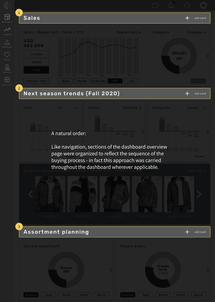
Dashboard section prioritization
Information manipulation

Execution 1: Filters ('lookbook')

Execution 2: Filters (sales overview)
Information manipulation
Filters ('lookbook')
Filters (sales overview)
Information simplification

Execution 1: Trends overview (trend insights)
On the overview portion of the dashboard, trend insights were simplified to 6 total data points (per category) to provide a holistic overview of all three major trends at-a-glance while still preserving the most critical and frequently-sought data points (3 highest, 3 lowest trends) - an approach supported through our user interviews during preference testing. A complete view with all the data points can be accessed from the insights section, or by clicking 'see more'.

Execution 2: Audience look-up by zip code (consumer insights)
In one part of the 'Insights' section, we were tasked with creating a tool to help users find audience insights by zip code. Initial designs for this tool prior to our work was just a list of 'top relevant zip codes' - which users did not understand and was universally disliked.
Our solution was to employ a visual model of the states in the US, with the selected region (left) providing much-needed context to groupings of zip codes (right) for users to break-down the understanding of information presented to them. This approach was also validated through preference testing (user preference 100%).

Interface philosophy: modular, flexible, customizable
I used a 12-column grid layout and created a modular interface that structures the dashboard, with major sections separated by section headers.
Users are able to customize their dashboards by adding or removing cards, and create custom sections.
We also wanted to address individual preference as an element of what 'intuitive' meant for users.
Prototype V1
a v1 prototype was built with
Validating the design
Using the prototype, we conducted usability tests for the final leg of this project.
Methodology:
A semi-structured, moderated test consisting of a set of 5 tasks to complete, as well as a set of attitudinal follow-up questions after task completion.
8 test participants completed their sessions remotely, over Zoom.
Determining what to measure
To determine the tasks that we wanted users to complete for the usability test, we conducted a Hierarchical Task Analysis to best replicate how users would achieve the goal of making "evaluations to buy for next season".
Of the many subtasks that emerged, 5 tasks were selected and made completable on the prototype for testing.

Quantitative findings
There were 4 tasks that users were asked to complete:
Please locate and evaluate how the color 'blue' is trending for next season. (Task 1)
Please determine which variation of 'blue' is likely to be most well-received by customers. (Task 2)
Please evaluate how the brand 'Zara' is trending in brand sentiment, compared to the brand 'Everlane'. (Task 3)
Using the filters in the catalog of products, please narrow down results to find a floral-pattern dress for the fall season. (Task 4)
Please navigate to the product detail page of this dress, and get a new product score. (Task 5)

Qualitative findings
Task 1
Drop-down menu at the top of the card is simple to use
Easy to visualize the color swatches
Big headers were very helpful in being able to locate the section for color
Task 2
Visualization makes it easy to see which variation is trending highest
"I kind of wish the font size of the colors were bigger. They are currently difficult to look at."
"Completing this task was very clear and straightforward."
Task 3
Would also like an option to save brands that are frequently monitored
"Super easy. Might also be nice to have trending brands on the dashboard overview."
"I think a search bar could be easier to than the tabs at the top of the insights page"
Task 4
Adding carrots to the right-hand filters would make it easier to locate controls
"It makes more sense to me to call 'lookbook' 'catalog'."
Task 5
"Refresh is clear, date stamp is helpful."
"Instead of a symbol, it might be nicer for it to say 'get new product score'."
Overall satisfaction measurements
At the end of usability testing, we also collected attitudinal metrics by asking 6 users to rate their overall experience with the prototype on a 5-point scale (1 - strongly disagree to 5 - strongly agree).
I was satisfied with the experience of this dashboard.
I thought the dashboard was easy to use.
I am likely to use this dashboard for work.

Task-level satisfaction measurements were also recorded - not represented in this section
"Charts are important but with a lot of numbers, it can get overwhelming and confusing."
- User 4, Buyer @Nordstrom
"Everything was clear, and easy to navigate. Good user experience."
- User 2, Omni-merchandiser @Ann Taylor
Next steps and recommendations
At the time of this project's completion, Neural Trend had 2 pilot clients that had yet to interface with the data through a live dashboard.
After all necessary hand-offs of documentation, assets, and specs, these were our recommendations.
Pilot prototype v1.0 with the 2 existing clients for feedback
Onboard the next UX/UI team and developers to all hand-off assets to iterate for version 1.1
Address the business need of building a vendor-side platform (identified through interviews with product team)
Results
A tried-and-tested framework for future design iterations.
Our research and workshopping delivered a strategically-sound, buyer-centric framework of which its concepts can continue to be applied to the dashboard's design moving forward.
A working demo critical for fundraising and building new relationships.
A week after completion of the project, Neural Trend was able to demo our prototype with a top 3 fashion retailer in the U.S., for feedback and an ongoing, custom use-case exploration.
The prototype was also used to demo for potential investors, as well as vendors using a vendor-side version of the platform introduced by our team during the final portion of sprint 3.
The successful launch of platform v1.
Three months after the delivery of our work, Neural Trend AI implemented our designs and launched a live version of the platform.
Reflections
User participation in the design process was invaluable.
A large part of why this project was successful was the enthusiastic participation and input by our users.
Thinking back on why this was the case, I believe these were the key factors:
Highly-relevant users. My team went through great lengths to secure interviews with the exact target audience of the Neural Trend platform, and their domain expertise really came through in discussion and participation.
Early participatory design sessions. Users had so much to offer in terms of feedback and opinions from day one, with a dashboard to look at -even one that was rudimentary and not yet organized. It really gave a us a seed from which to expand our explorations.
Conducting interviews, workshops, and users tests with the same users over multiple rounds. I think it's extremely helpful for the design process when users to see their own input brought to life through design, and become personally invested in its success and execution.