
Role:
product strategist
user researcher
end-to-end visual design + interaction designer
Outcomes:
launched a completely new dashboard experience for all policyholders
improved monthly active usage by 47%
delivered on company-level initiative to increase engaged policyholders
I redesigned a web dashboard for cyber insurance policyholders at Corvus.
It addressed a problem of motivation.
Why the policyholder dashboard is critical for Corvus, a cyber insurance company.
In 2023, as Corvus entered its 6th year as a cyber insurance provider, one very clear picture emerged from the data science team: engaged* policyholders were much less likely to file a cyber claim than those that weren't.
Likelihood to file a cyber claim


Unengaged policyholders
Engaged policyholders (17% less likely)
For Corvus and the insurance industry, this metric is really important - (incurred losses)/(earned premiums) - it is a calculation known as loss ratio, a leading indicator for underwriting profitability.
So if policyholders stay more engaged with their cyber insurance, that equates to better profitability for Corvus.
But policyholders weren't engaging with the dashboard.
*engaged defined as policyholder that has done any or all of the following: contacted the Risk Advisory team, completed a security recommendation, filled out the Questionnaire, or responded to a Sentinel Alert at least once within the policy term"
Understanding what matters for policyholders.
It really sucks to have to file a cyber claim, even if the insurance pays the business out. It means anything from customer data being stolen, to business interruption, to ransomware holding critical systems hostage.
So given this fact, it might seem that some sort of value added to cybersecurity would engage policyholders - but this would be an incorrect assumption.
In fact, the original Corvus policyholder experience was built in the likeness of a security dashboard, providing specific security recommendations as well as resources and latest news. It was a collection of features that, on the surface, were valuable. But policyholders simply didn't engage with it.
In other words, staying cyber-secure was simply not enough of a motivator for cyber insurance policyholders to engage with the insurance product during their policy term. And that was a problem for both the business and the customer.
Problem
Corvus would benefit from policyholders engaging with their cyber insurance, but the existing experience did not provide enough motivation for them to do so.
I deconstructed the problem through First Principles and frameworks.
First principles:
Why should a policyholder engage with their cyber insurance?
This question is one of motivation; it could easily be re-written as "What do policyholders care about when it comes to cyber insurance?" And when posed this way, we see that motivation is directly tied to value.
A simple framework like the Value Exchange Model can help pinpoint what it is we're talking about:
The fundamental business model.
Establishing the fundamental model allows us to explore the parallel layers that exist within this relationship. Below, we explore the question of, "what value can be exchanged for policyholders engaging with Corvus during their policy term?"
An incomplete in-policy engagement model.
Framing it this way highlighted the essence of the problem.
And since the existing version of the dashboard wasn't providing a meaningful value exchange for policyholders, we had to learn what would.
Talking to our users, the backbone of our research question was a simple one.

"What matters to you most when it comes to cyber insurance?"
"Just tell me exactly what to do so I can get renewed next year."
Renewal - efficiency
"I want to know if I'm in a good place for renewal next year."
Renewal - security
"I need way more time and heads up for some of the bigger fixes."
Renewal - security
"I'd like to keep the same premium when I renew next year."
Renewal - cost
"Only tell me what I need to know. If I get an email everyday, I'll ignore all of it."
Communication - efficiency
Communication - relevancy
"I'm always having to answer the same questions over and over again. It would be nice if you could save my answers from the previous application."
Renewal - efficiency
These were the themes that emerged.
After this exercise in thematic analysis, it became clear that policyholders cared about one primary thing: renewal.
Specifically - the ability to renew, and the cost of renewal.
A complete in-policy engagement model.
A logical give-and-take emerges if we revisit the value exchange model.
And from the perspective of lowering claims and cyber incidents, this was an alignment of interest from both the business and customer.
Embracing a singular intention: a renewal-centric dashboard.
The insights from our discovery led us to the realization that the entire policyholder experience should be renewal-centric.
This didn't mean that we'd abandon features in the existing dashboard - but it meant that those features would be framed through the lens of renewal, giving every evaluation and action a singular purpose for the policyholder: make renewal easier, and as cheap as possible.
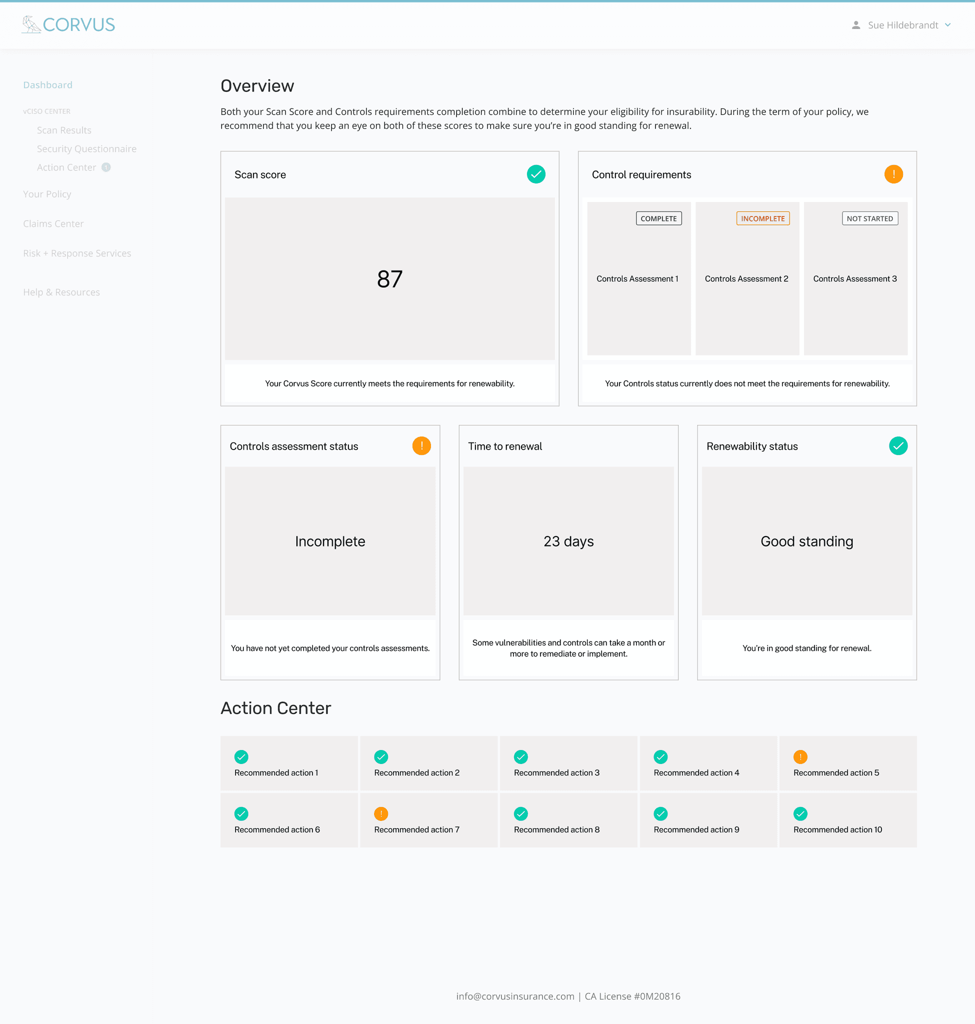
Revisiting the old dashboard
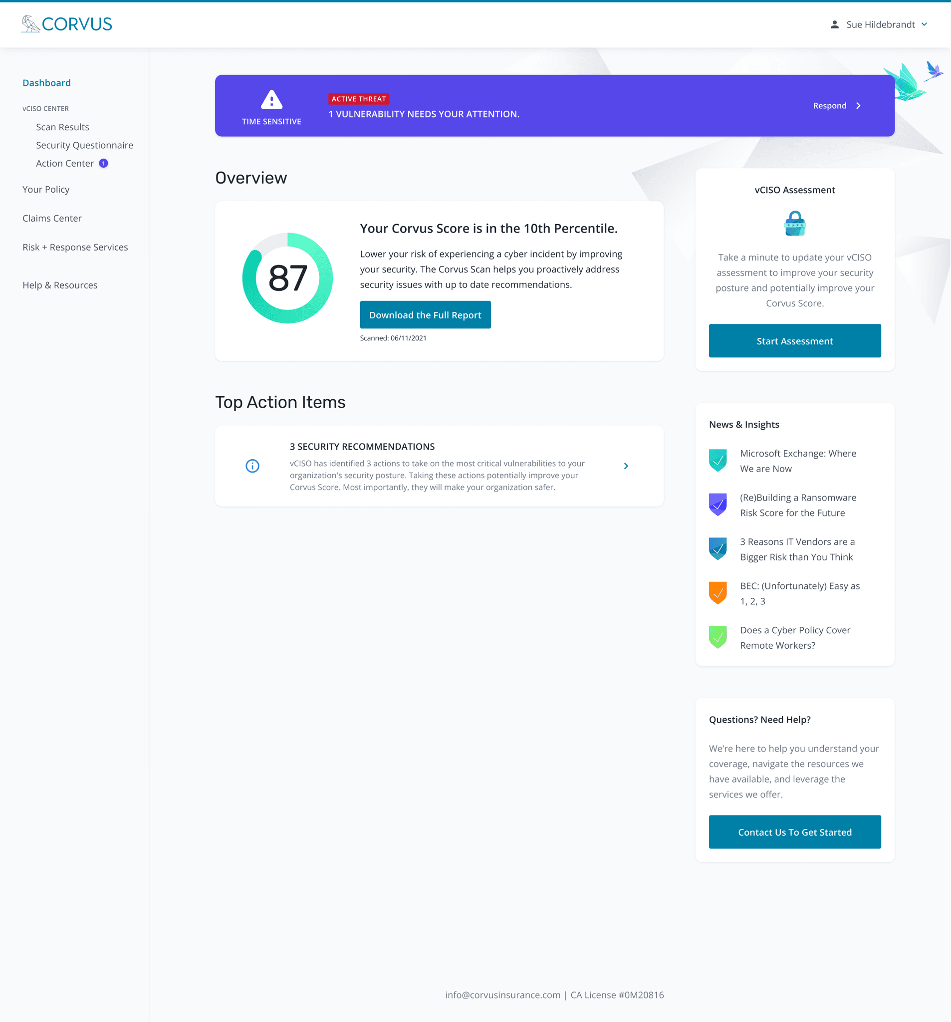
The old dashboard presented a collection of features without an obvious guiding intention.
It needed perspective, and to impart status transparency about the policy they had with Corvus.
Divergent explorations

Exploration 1: Status
The main concept behind this wireframe was to utilize status patterns to provide users with clear understanding of their position in the renewal journey - to reduce uncertainty, set expectations, and provide users a sense of place.
Exploration 2: Progress
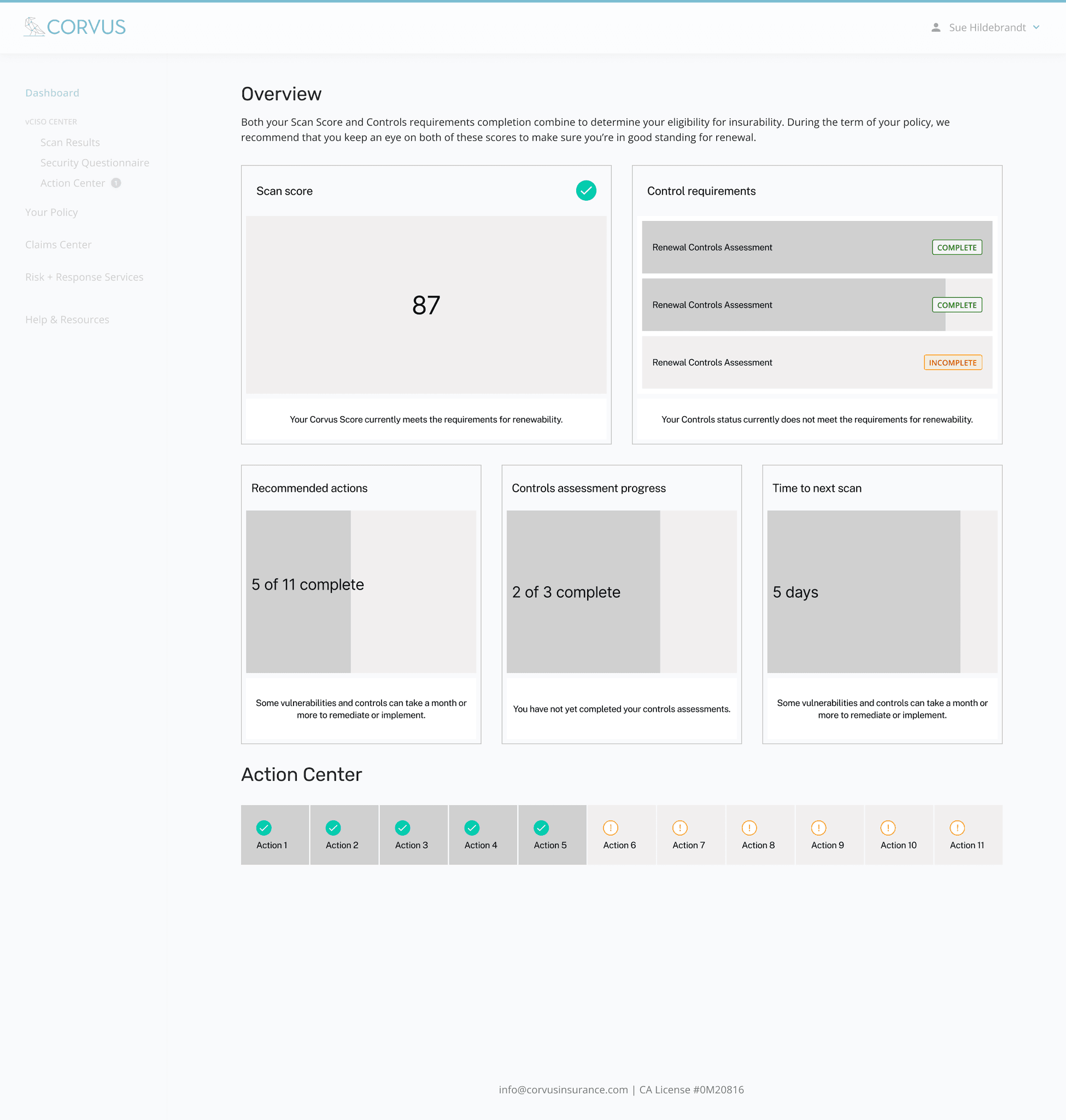
The main concept behind this wireframe was to utilize forward progress patterns to orient users from the perspective of task completion - to cultivate a sense of achievement, to reward actions taken, and visually quantify their place and in the renewal journey.
Exploration 3: Change over time
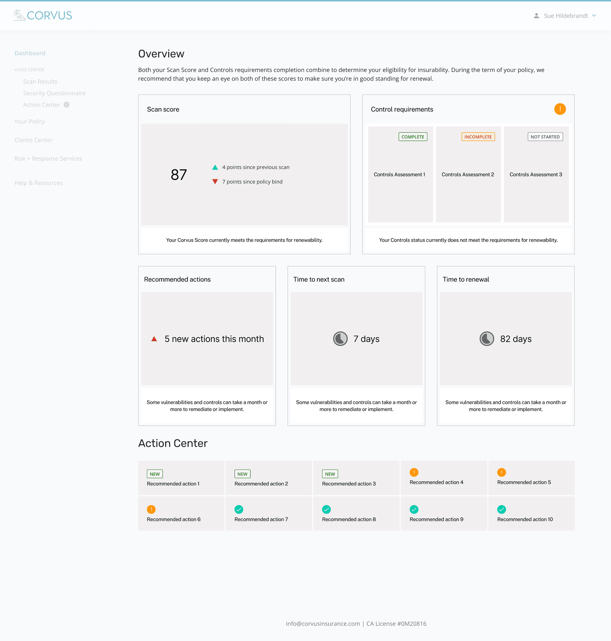
In this 3rd wireframe, the main concept was to utilize patterns that indicate change over time to convey the dashboard's dynamism and communicate urgency to issues that may have risen since their last check-in or regularly scheduled scan.
User testing for usability, feature validation, and and copy clarity

Over the final 2-week stretch of the cycle, we were able to get these designs in front of 13 policyholders for some rigorous feedback sessions.
I also conducted tests using maze.co for usability, feature validation, and copy clarity.
Final design
We launched version 2.0 of the Policyholder Dashboard.
Each module in the new dashboard was now guidance for how that information was to be interpreted in the context of renewal, giving users a sense of status transparency.
During this cycle, I endeavored to start solving a wide-spread issue of inconsistent layout behavior across Corvus applications.
I worked with the engineering team to adopt the principles of CSS flexbox as standard front-end development philosophy, moving the legacy application to be more responsive and consistent.
As a result, part of my spec work visualized flexbox structure and behavior of UI elements.
Hand off

47% increase in MAU (monthly active users) over the first 6 months after launch
36.6% increase in returning users first 6 months after launch (vs previous-year benchmark)
148% increase in time-spent on dashboard page
312% increase in 'actions completed per policyholder' metric (vs previous-year benchmark)