
Role:
user interviewer
product designer
stakeholder persuader
Outcomes:
launched a reimagined email experience
improved sign-in rates by 3x
improved avg. open rate by 2.7x
delivered immediate value to policyholders
I redesigned the policyholder email at Corvus, a critical touchpoint in the insurance policy lifecycle.
It addressed a problem of immediate value.
We were sending an email to policyholders once a month, and it wasn't being read or opened.
Why weren't they opening the email?
What was the email trying to accomplish in the first place?

Here's what I gathered:
call to action to review 'security report' (primary CTA)
educate policyholder on what the security report is
educate policyholder on 'vCISO Center'
call to action to fill out the 'security questionnaire'
educate policyholder on 'Action Center'
call to action to speak to service team
As a whole, there were too many things being attempted at once.
Visually, it felt like a giant wall of text.
But most importantly, there was no information that we knew policyholders valued within the email.
This was the email that was being sent to policyholders once a month.
I wanted to understand the intent behind every element in the email, so I did a quick audit.
Looking at the numbers
We had mediocre email engagement - a 15.6% open rate, which was below industry average.
We wanted to understand why, and after looking at the numbers my hypothesis was that it had to do with two factors: content and cadence.
One might think, "When it comes to open rates, doesn't the email subject line have more to do with it than anything else?" And that's a valid question - but it would be more applicable if the subject line was always changing. In a situation where we were sending the same automated email with the same subject line, we could look at things in a little more detail:
Evidence pointed to the fact that it wasn't so much the subject line that mattered, rather a diminishing interest in the repeated email that was being sent to them. We hypothesized that this could be due to a few things:
policyholders not finding value in the emails (saw it once, wasn't useful)
policyholders becoming "email blind" due to frequency (seen as spam)
In subsequent interviews, we we able to confirm both.
After several user interviews and revisiting old feedback, it was clear that policyholders wanted to know a few key things during the term of their policy:
What's my Corvus Score?
Am I in good standing for renewal?
The problem was that we had this information hidden behind a log-in. We weren't providing immediate value.
When something has lost its way or no longer makes sense, it's really useful to get back to First Principles with the question "what are we trying to do here?"

a first draft at what we wanted to provide in the email
First principle: the policyholder email should impart immediate value for the user.
The second order of business was to address the cadence and frequency of the policyholder emails.
I explored two factors as a function of frequency, using a cartesian framework - impact and value.
Impact as a function of Frequency
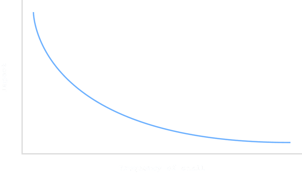
The above relationship, while grossly simplified, illustrates the point that there is likely an inverse relationship or negative correlation between the impact an email has on a policyholder and the frequency at which it is sent. The more emails that get sent, the more spammy it becomes. The obvious thing that this tells us is that we should be optimizing by reduction.
Value as a function of Frequency

The second function pointed to another factor or dimension which might matter more than just frequency - cadence of emails.
Value as a function of Cadence

In the revised version above, we were getting to something more true - when it comes to value for the policyholder, we need to consider both the frequency AND timing of the emails.
Up to this point, we were sending an email once a month. We asked policyholders point blank about this - they said currently it was too much, and they were just ignoring them.
Too much

email sent once a month (11 times in 12 months)
So how often did they want to hear from us? It turned out that cadence was about once a quarter.
Much better

email sent once a quarter (3 times in 12 months)
When designing this email, I faced the challenge of working within MJML's structural limitations. MJML (Mailjet Markup Language) provides essential responsive functionality, but required a simplified design approach for cross-client compatibility.
The limitations of MJML guided some of my design decisions, which meant prioritizing:
Clear visual hierarchy through spacing and typography
Thoughtful color blocking to create visual interest without complex layouts
Strategic use of the limited custom styling options available